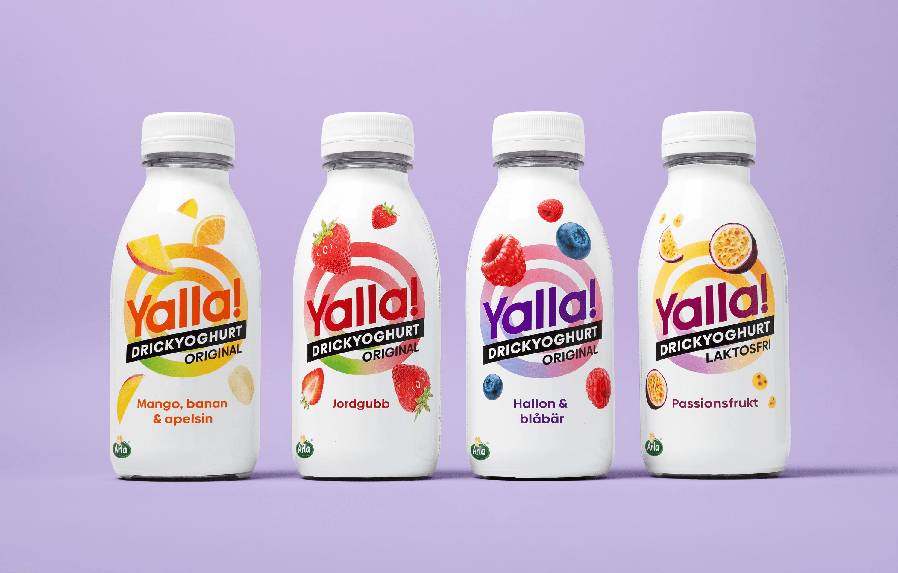
Arla wanted to bring the products within their on-the-go drinking yoghurt range closer together. The goal of this redesign was to create a louder, prouder, and more iconic Yalla by developing a logomark that would be clearly distinguishable across all products, while also better highlighting the flavours and functions of each product.
I worked on this project in a team while employed at IW Agency.

Design system
The new Yalla design system needed to differentiate 12 products across five sub‑categories while maintaining coherence as a unified system. To achieve this, the Yalla logomark was adapted to incorporate the different sub‑category names in a consistent style within the logo.


Sub-categories
Each sub‑category addresses different consumer needs. To communicate those qualities more clearly and differentiate each sub‑category, we used variations in background colours, the number of fruit images on the bottles, a structured logomark colour system, and product claims.

Flavour differentiation
The products within each sub‑category also needed to be clearly differentiated by their functions and flavours. To achieve this, we used different logomark colours, images, and claims.

