Mika Matcha
Passion Project, 2025
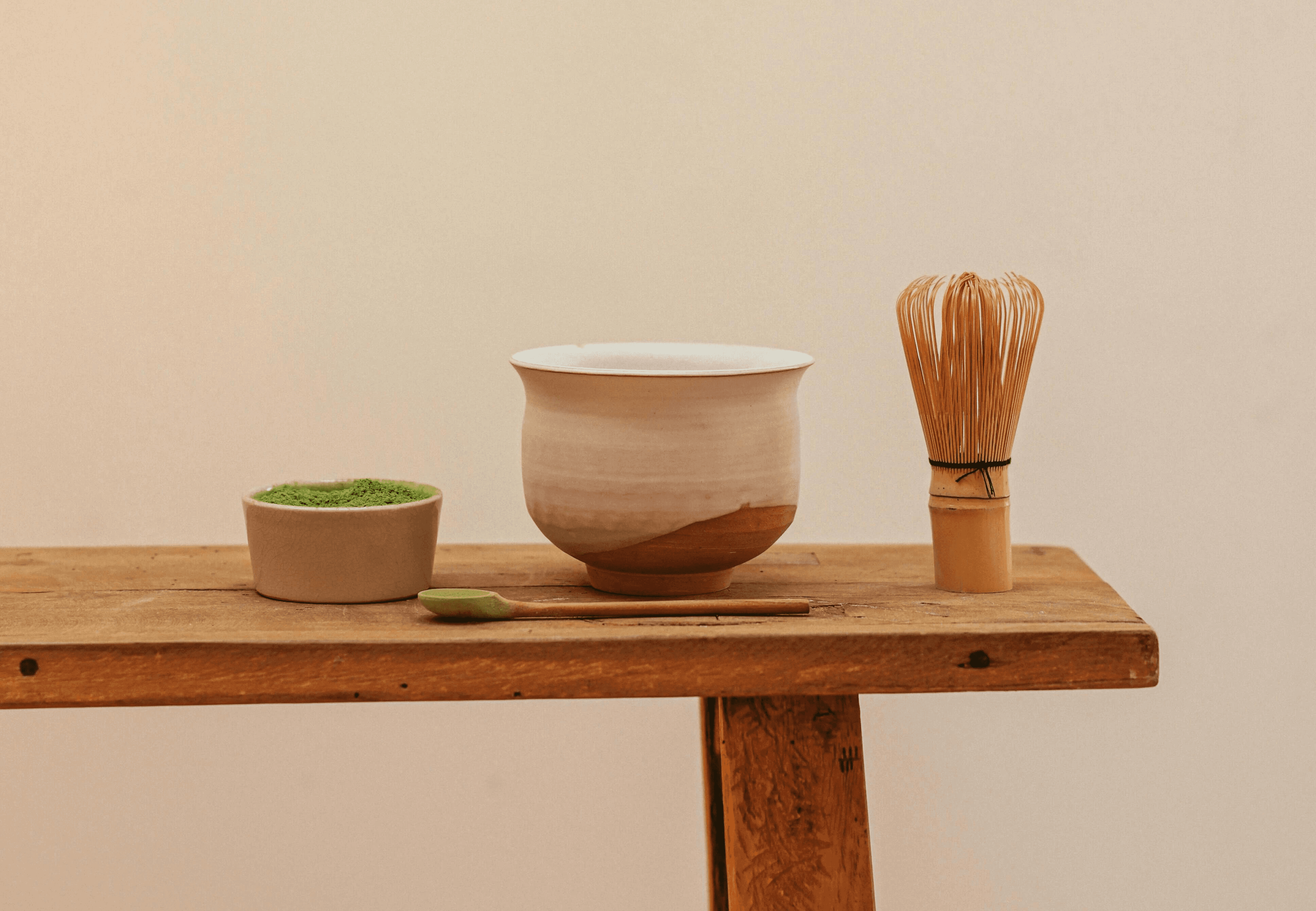
Mika Matcha is a conceptual matcha powder brand that strives to help people find inner peace through the world of matcha. The idea with the branding was to communicate the brand's purpose through every visual element by using a colour palette inspired by nature, minimalistic layouts, product photos influenced by zen gardens, and a general sense of stillness woven through each detail. Together, these design elements create moments of zen even before the first sip.

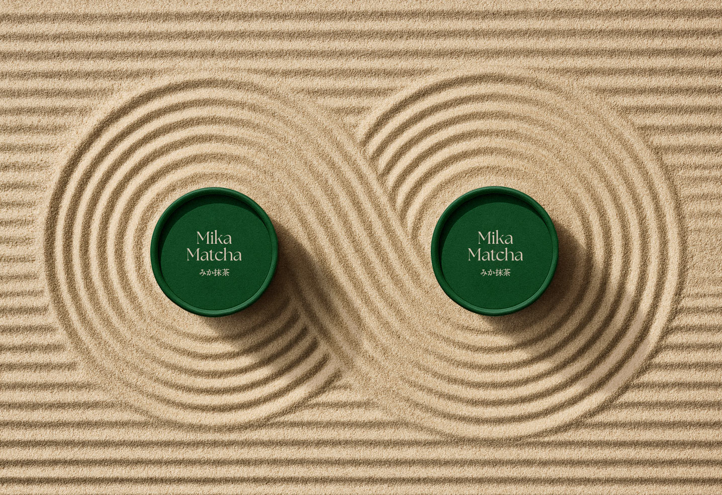
Packaging & pattern
The packaging and patterns draw inspiration from the tranquility of zen gardens, embracing a minimalist and orderly aesthetic.

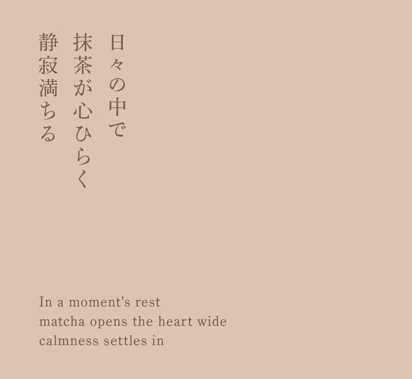

Typography & colours
The brand's typography and visual communication draw inspiration from haiku poetry, delivering messages through structured simplicity and intentional restraint. Every element serves a purpose, and the unnecessary is eliminated. The color palette features muted, naturalistic tones of rich forest greens and earthy browns, inviting stillness and quiet reflection.